
Typography
The physical appearance of typography — the size, colour, and most certainly the font – plays an incredibly important role in the way in which written pieces come across.
The primary typeface for you to remember for all our communications is FF Nort.
Heading 1
FF Nort Bold
Aa Bb Cc Dd Ee Ff Gg Hh Ii Jj Kk Ll Mm Nn Oo Pp Qq Rr Ss Tt Uu Vv Ww Xx Yy Zx 1234 /()&!@$
Heading 2
FF Nort Bold
Aa Bb Cc Dd Ee Ff Gg Hh Ii Jj Kk Ll Mm Nn Oo Pp Qq Rr Ss Tt Uu Vv Ww Xx Yy Zz 1234 /()&!@$
Heading 3
FF Nort Bold
Aa Bb Cc Dd Ee Ff Gg Hh Ii Jj Kk Ll Mm Nn Oo Pp Qq Rr Ss Tt Uu Vv Ww Xx Yy Zz 1234 /()&!@$
Heading 4
FF Nort Bold
Aa Bb Cc Dd Ee Ff Gg Hh Ii Jj Kk Ll Mm Nn Oo Pp Qq Rr Ss Tt Uu Vv Ww Xx Yy Zz 1234 /()&!@$
Paragraph 1
FF Nort Regular
Lorem ipsum dolor sit amet, consectetur adipiscing elit, sed do eiusmod tempor incididunt ut labore et dolore magna aliqua. Ut enim ad minim veniam, quis nostrud exercitation ullamco laboris nisi ut aliquip ex ea commodo consequat. Duis aute irure dolor in reprehenderit in voluptate velit esse cillum dolore
Paragraph 2
FF Nort Regular
Lorem ipsum dolor sit amet, consectetur adipiscing elit, sed do eiusmod tempor incididunt ut labore et dolore magna aliqua. Ut enim ad minim veniam, quis nostrud exercitation ullamco laboris nisi ut aliquip ex ea commodo consequat. Duis aute irure dolor in reprehenderit in voluptate velit esse cillum dolore
Paragraph 3
FF Nort Regular
Lorem ipsum dolor sit amet, consectetur adipiscing elit, sed do eiusmod tempor incididunt ut labore et dolore magna aliqua. Ut enim ad minim veniam, quis nostrud exercitation ullamco laboris nisi ut aliquip ex ea commodo consequat. Duis aute irure dolor in reprehenderit in voluptate velit esse cillum dolore
Formatting
For headlines or copy using Regular font weights, you can use the default font kerning (spacing between the letters) which is typically ‘0’. When using Medium, Bold, Black or Ultra font weights, the kerning can be reduced to bring the letters closer together as per the example shown below. In Indesign or Illustrator typically you can make the kerning value ‘-30’, but that value may vary on other platforms depending on how they measure it.’

Using Complimentary Fonts
Complimentary fonts can be used. However, please use sparingly. They work best for short titles or headlines.

Avoid using multiple fonts and styles that clash. Avoid using formal script fonts. Instead use a script font that looks natural and dynamic.

Using a combination of FF Nort and a single complimentary font creates a balanced composition. In this example, FF Nort is used for all supporting copy, maintaining brand consistency.
Looking for quality complimentary fonts? Use these links below. If you download FREE fonts, always check they are royalty free.
https://fonts.google.com/ http://www.losttype.com/ www.behance.net
Download

Official Font
FF Nort can be purchased from MyFonts.com. It is also available in the Squarespace font library for Catch The Fire Churches and Organisations that use Squarespace to host their website.
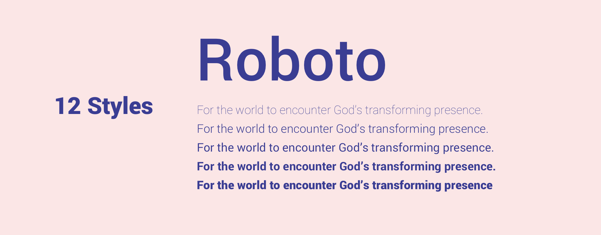
Free Alternative to FF Nort
Please use the primary font If you are not able to purchase the official brand font then please download Roboto a free alternative
Brand Coaching
The physical appearance of typography — the size, colour, and most certainly the font plays an incredibly important role in the way in which written pieces come across.
Enjoy catching up on this global brand coaching session from August 28th 2019 where the Typography component was explored.
Questions?
If you are having trouble with anything in this guide, you are missing brand elements from the brand package, or you are unsure if your communication best represents the Catch The Fire brand, please contact the Catch The Fire design team at branding@catchthefire.com